
Color Analysis Explained: The Style Secret That Makes Everything Look Better
- Megan Bentley
- Feb 13
- 4 min read
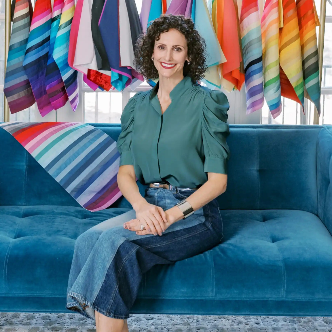
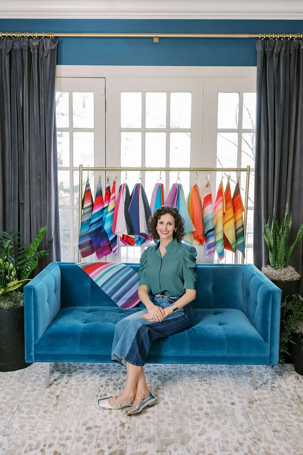
By Megan Bentley, The Color Countess
You have done everything right. You upgraded your makeup, refined your personal style, and invested in quality pieces that should work. And yet something still feels off. Not wrong. Not bad. Just unfinished.
That quiet disconnect, where everything looks good individually but the mirror does not quite reflect the woman you know you are, is exactly why color analysis changes everything. After nearly thirty years of believing I was wearing my best colors, I discovered I had been misclassified. One small correction, adjusting the temperature and intensity of the colors closest to my face, transformed my entire appearance. My skin looked clearer, my features sharper, and my overall look finally felt calm, cohesive, and intentional. Color analysis works because it restores visual harmony, and once you experience that clarity, you cannot unsee it.
Why Even the Best Style Can Still Feel Off
Early in my career, I watched brilliant, accomplished women sit in my chair wearing stunning clothing, beautifully applied makeup, and expertly styled hair, yet still look slightly disconnected from themselves. Not because they lacked taste. Not because they needed more effort. But because every choice had been made without understanding the single factor that governs visual harmony.
This is where color analysis stops being a beauty buzzword and starts becoming science. The human eye and brain are wired to seek harmony before we ever consciously interpret beauty. Our visual system is constantly scanning for balance, proportion, and coherence. When colors near the face contradict the skin’s natural undertone, value, or intensity, the brain registers conflict even if we cannot explain why. That unsettled feeling is not personal preference. It is neurological.
When color aligns with your natural pigmentation, the face reads as calm, clear, and complete. When it does not, the eye works harder. We perceive dullness, fatigue, or imbalance and instinctively try to correct it with different hair colors, more makeup, more contour, more product. Color analysis works because it removes the fight.
What Color Analysis Actually Is
Color analysis is the process of identifying the precise temperature, value, and intensity of color your natural pigmentation needs to look balanced, healthy, and luminous. It is not about trends. It is not about rigid rules. And it is not about being told what you cannot wear. It is about understanding how your skin, hair, and eyes interact with pigment at a biological level.
When the right colors are placed near the face, the effect is immediate. Skin appears clearer. Eyes sharpen. Bone structure looks more defined. When the wrong colors dominate, shadows deepen, redness increases, and even the best makeup begins working against you. This is why color analysis is not a passing fashion moment. It is a correction of visual harmony.
Where Fashion, Beauty, and Art Intersect
I often explain color analysis through art and interior design, because the principles are identical. Imagine walking into a beautifully designed room. The architecture is flawless. The lighting is perfect. The proportions are right. But the artwork is wrong. The undertone on the walls clashes. The metal finishes feel off. The saturation of the furniture does not belong. Suddenly the room feels disjointed, not because the pieces are bad, but because they are not in harmony with the space.
Your face works the same way. Your skin is the architecture. Your bone structure is the foundation. Your hair, makeup, metals, and clothing are the art and furnishings. When those elements are chosen without regard to undertone, value, and intensity, even the most expensive choices can fall flat. When color is right, style becomes effortless. When color is wrong, styling becomes a constant attempt to compensate.
A More Modern Approach to Color Analysis
Most people believe color analysis begins and ends with being labeled warm or cool. That oversimplification does not reflect how human pigmentation actually works. I am master trained in the advanced sixteen season system, a methodology rooted in classical color theory and the science of how the eye perceives color. My work is not based on preference or trend forecasting. It is based on biology, light behavior, and pigment interaction.I specialize in undertone education because undertone is where harmony is won or lost. I work with private clients as well as hairstylists, makeup artists, executives, influencers and beauty professionals who need their work to perform consistently across lighting conditions, cameras, and environments.
What truly sets my approach apart is application. I do not hand clients a list of restrictions. I teach them why certain colors work, how to use contrast intentionally, how to choose metals, hair color, and cosmetics that support their natural pigmentation, and how to build a wardrobe and beauty strategy that actually compounds over time. When you understand your color identity, shopping becomes precise. Makeup becomes simpler. Hair color becomes predictable. And personal style finally feels cohesive. Color analysis, when done correctly, is not a makeover. It is a framework. And once you understand the framework, every choice that follows feels easier, more intentional, and unmistakably you.
About the Author
Megan Bentley is a master trained color analyst and the founder of The Color Countess, a consultancy specializing in advanced color analysis and undertone education for women and men. Known for her scientific approach and engaging, game show style presentations, she works with private clients, beauty professionals, and executives across the country to help them build wardrobes and beauty strategies rooted in visual harmony rather than trend. Her work focuses on the intersection of color theory, biology, and personal style. www.TheColorCountess.com or @TheColorCountess on Instagram & TikTok.


I struggled with my wardrobe for a long time — I bought fashionable clothes, but I looked tired because the colors were "almost" right, not exactly right for me. After the analysis, everything changed: now shopping is faster, my outfits are more harmonious, and my confidence has grown. But in order not to waste time on blind experiments, I switched to arbitration — there, too, data accuracy is required, otherwise the budget is wasted. Setting up RedTrack with postbacks gave me a clear picture: which creatives and geos bring conversions, where to optimize. If you want to see real campaign results just as quickly, use this link — a step-by-step guide with ROIads integration, templates, and tips. This gave m…
Limited sneaker releases can move quickly, so timing and verification matter. After placing an order for a pair I’d been tracking for months, I wanted to understand inspection phases before shipment. I contacted stockx customer service phone number, which helped outline authentication checkpoints and payout sequencing. Knowing exactly how items transition between seller verification and buyer dispatch made the process feel structured rather than rushed, and it influenced how I approach future purchases in that marketplace.